

PROJECT — 01
PROJECT — 01
Cosmos
Brand Identity
Cosmos
Brand Identity
Cosmos
Brand Identity
YEAR — 2026
YEAR — 2026
INTRODUCTION
INTRODUCTION
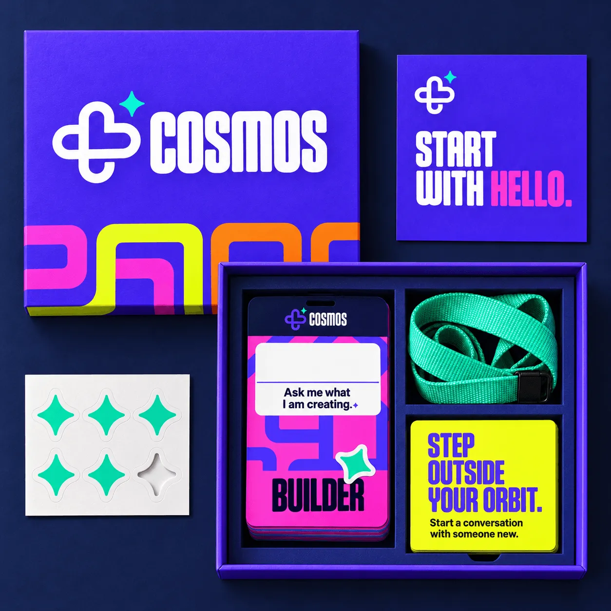
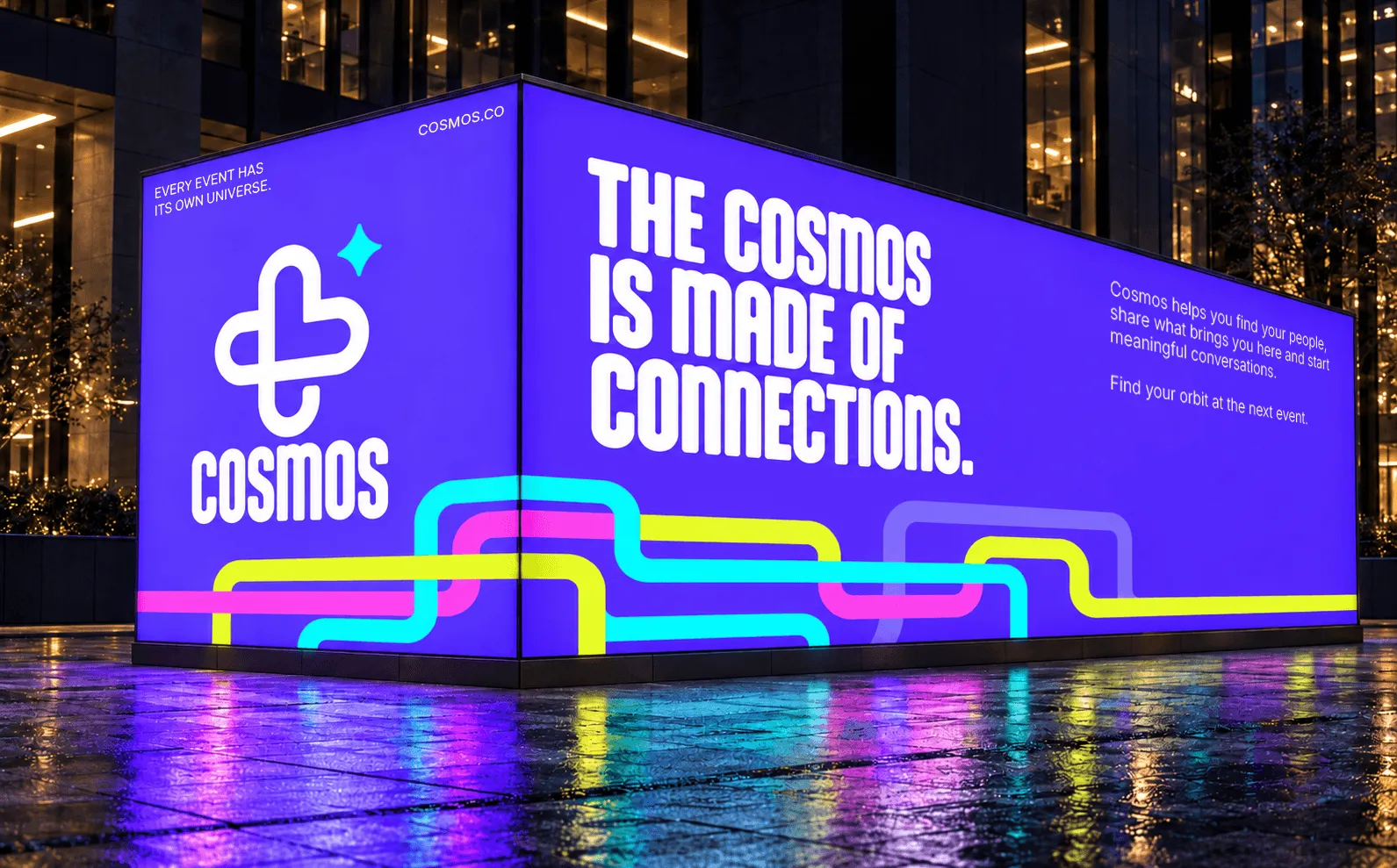
Cosmos is a brand identity and social-navigation experience designed to make connecting at events easier. The identity combines friendly geometry, expressive typography, and a flexible graphic system to bring the experience to life across physical and digital applications.
Cosmos is a brand identity and social-navigation experience designed to make connecting at events easier. The identity combines friendly geometry, expressive typography, and a flexible graphic system to bring the experience to life across physical and digital applications.
Cosmos is a brand identity and social-navigation experience designed to make connecting at events easier. The identity combines friendly geometry, expressive typography, and a flexible graphic system to bring the experience to life across physical and digital applications.
Cosmos is a brand identity and social-navigation experience designed to make connecting at events easier. The identity combines friendly geometry, expressive typography, and a flexible graphic system to bring the experience to life across physical and digital applications.
SERVICES
Brand Strategy, Visual Identity, Art Direction, Event Experience, Print & Digital Design.
Brand Strategy, Visual Identity, Art Direction, Event Experience, Print & Digital Design.
Brand Strategy, Visual Identity, Art Direction, Event Experience, Print & Digital Design.
Brand Strategy, Visual Identity, Art Direction, Event Experience, Print & Digital Design.

WHAT IS COSMOS?
WHAT IS
COSMOS?
WHAT IS COSMOS?
Events bring people into the same room. Knowing who to approach is another matter.
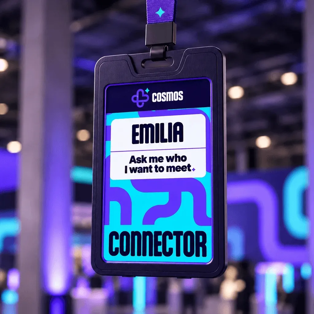
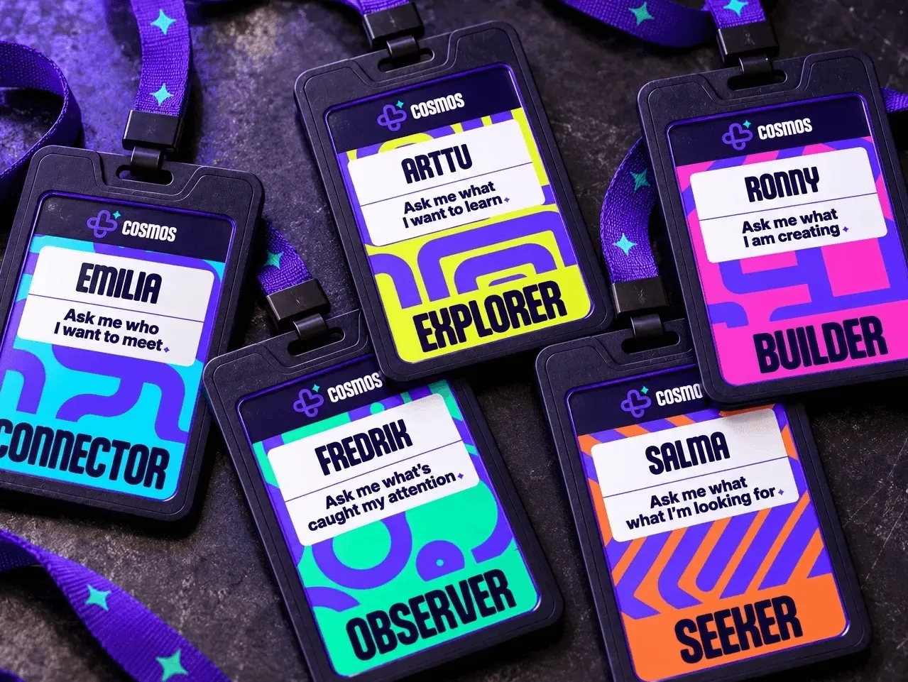
Cosmos is a social navigation experience that makes people’s intentions visible helping attendees find a starting point for meaningful conversations, and making connections.
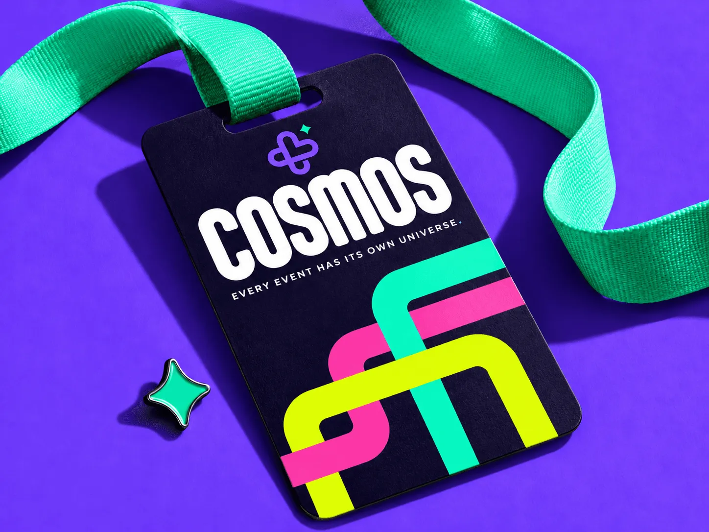
The project covers brand strategy, visual identity, an event participation system, and applications across print, digital, signage, and merchandise.


LOGO DESIGN
LOGO DESIGN
The Cosmos symbol combines a planet, the letter C, and a heart, bringing together the brand’s name, cosmic theme, and focus on human connection. Rounded corners and thick outlines give the mark a friendly, approachable character.
The separate four-point star represents the individual within the wider system. The symbol’s rounded geometry establishes the construction language for the identity, informing its icons, graphic paths, and patterns.


LOGO CONSTRUCTION
LOGO
CONSTRUCTION
LOGO CONSTRUCTION
The symbol’s stroke thickness defines X, the base unit of the Cosmos identity. This measurement guides the construction of the symbol and wordmark, their spacing, and the layout grid across applications, maintaining consistent proportions throughout the system.
The symbol’s stroke thickness defines X, the base unit of the Cosmos identity. This measurement guides the construction of the symbol and wordmark, their spacing, and the layout grid across applications, maintaining consistent proportions throughout the system.
The symbol’s stroke thickness defines X, the base unit of the Cosmos identity. This measurement guides the construction of the symbol and wordmark, their spacing, and the layout grid across applications, maintaining consistent proportions throughout the system.
The symbol’s stroke thickness defines X, the base unit of the Cosmos identity. This measurement guides the construction of the symbol and wordmark, their spacing, and the layout grid across applications, maintaining consistent proportions throughout the system.


BRAND STRATEGY
BRAND
STRATEGY
BRAND STRATEGY
Cosmos needed to make approaching someone feel easier. That helped me shape the identity. Rounded forms and bold typography created an approachable character, while bright colours made participation visible in a busy event environment.
I created the design to balance playfulness with structure. Expressive graphics attract attention, while consistent proportions, clear layouts, and readable information make the system practical for organizers and attendees. This allows Cosmos to feel welcoming at a student festival and credible at a professional conference.
Rather than defining who someone is, the brand communicates what they want from that particular event. That flexibility is central to its positioning.






OTHER WORKS
OTHER WORKS
Check out my other projects!
Check out my other projects!
Check out my other projects!
Check out my other projects!